Logo speaks louder than any voice, because it has no language barrier, it can spread anywhere in any part of the world. But it needs to be good and catchy. It is simple, concise but can speak thousands of powerful words with just a symbol. Yes, this is the power of logos that can take your business to a new height. So, designing a logo is a tough job, at least you need to maintain essential logo design guidelines to make it worthy of all. In this article, we have presented 14 essential logo design guidelines for you.
1. Sketch Your Idea
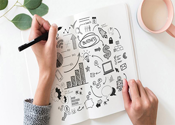
This is the first step, even the most important first step. Sketch your idea, see how it is going to look in real life. Reality is far far away from the imagination. As a designer, you have created a proper bridge between reality and imagination. Sketch is the perfect bridge. You can see it in real life and can change it immediately. Besides, it is a good idea to reject it before it is fully made. Otherwise, you have to waste a lot of energy and resources.
Make several copies of your ideas, play with it, improvise it, try different options, try it from different angles. If none of them can’t satisfy you, then move on to the next idea. Sketch new ideas and make different versions of it.
It might sound time consuming, but believe me, it will save your energy and make you a more professional designer in the market. Because all the expert designers spend most of their time in this initial stage. When you know what to do, then you can do it easily.
2. Create A Proper Balance
Logo is not an art work, rather it is artwork for business. Which means people with zero knowledge of art will see your logo and comment on this. People with no idea color might find your logo too gorgeous.
This is the reality and this is why you have to balance your design in terms of color, size and art work. It should have everything in balance. So that everyone in the room can get the message.
However, you may break the rule of balancing for the sake of creativity but it should be in a limit. You need to maintain the proper weight of the graphics, usage of color and proper size of the elements used in the logo.
3. Consider Logo Size
Size does matter in the logo design. Your logo has to be compatible in every size and every design. Which means it should look good when it is placed on the letterhead and also need to look good on the big banners and billboards. Your logo should not lose it’s detail, if it does, then your logo design effort will be considered as a failure.
You must be thinking on how to test this measurement? Pretty simple, test it by yourself. Before going for the final output, place your logo on the envelope or on the letterhead Then check whether your logo loses its details. If yes, then redo your logo design task and make it compatible.
Remember your logo is the representation of your business. If it doesn’t look compatible on big screen and small screen, then it will look unprofessional. No doubt customers will never pay for the brand who looks unprofessional. So, test your logo on a different scale and make it dynamic that fits perfectly in every size.
4. Keep Color Theory in Mind
Color is the heart of any design. Proper use of color makes an attractive logo. A good color combination can bring life to any design. But for designers colors have more things to share. Yes, as a design you must follow the color theory which is widely accepted and bring more success in the design.
Not using color, using closer shade in the design, using eye-soothing color are some of the important theories of color. Use them to make your logo attractive which is your ultimate goal. However, rules never work well in creative work. So, you can sometimes break the color rule only when you have a proper reason for that.
Psychology of the color is also important in the design. Design is an art work, and every artwork evokes some feelings for the audience. In other words color is the language of design. Each of the colors communicate different feelings to the audience. For example, red communicates love, aggression, violence refers to elegance, yellow and green give juvenile feelings and so on. So if you are using color math it with its target audience so that it gets more acceptance than others.
5. Consider Brand Personality
Every brand has their own story. Each of them are different. It is like a human who may look alike but are not similar at all. So, we call it personality. Like humans, every brand has personality too.
So, never ever try to copy the following logo trend in your logo design. Rather study your clients target market, their behaviour, brand positioning and its personality in the market. Then branstrom ideas that align seamlessly with the brand after that come up with your logo design that communicates brand personality pretty well.
For instance, think about Nike. It represents sports, fun, activity, fitness and everything related to sports. The logo of Nike also gives a similar feeling that perfectly aligns with the brand personality. It may look simple but effective and perfect. So, never ever forget to study the brand personality while designing a logo.
6. Clever Use of Typography
Not every logo is icon based. There can be a mixture of text and icon. All together makes a perfect logo. Yes, text is also a part of design. So you can not ignore it. Using an eye-catchy typograph in the logo can make your design distinctive and attractive. So, if you haven’t focused on the font while designing a logo it is high time you start focusing on it. Even expert designers spend so many hours selecting the perfect font for the logo.
Yes, it is that much tough. Because you can not use a common font, that will give amature look to your logo. You can’t use fonts that are not compatible in every size. You can’t use multiple fonts in the logo that will surely bring an odd look to your logo.
Use a font that is not commonly used and matched perfectly with the design. It will be great if you can redesign a unique font and use it in the logo. This will make your logo standout in the market. If you want to use multiple fonts, do not use more than two. Remember, font might look simple but it has the power to make your logo look more attractive and distinctive than others. Just check out the logos of KFC, Facebook and Twitter aren’t they great because of their distinctive font?
7. Be Different
Leaders do never copy, they create new trends. In designing, difference is the key. In business, the difference is the currency. Yes, you read it right, the difference is the currency. If a business can stand out in the market it can easily be traced and remembered by its target group. But if it fails to do that, it fails to grab a huge number of customers and thus lose money.
So, being different is the key aspect of any business and it started with the logo. As said before, a logo is the representation of the business, so it has to be unique, different and catchy.
Steve Jobs used a half eaten apple as the logo of the apple brand for the first time. It was simple and different because there were no other electronic brands who used apple as their logo. So using a fruit as the logo icon for an electronic brand broke the trends and stood out easily in the market.
To make your logo distinctive use several designs and styles. Go beyond the rules to give an original look. But never forget to keep your reason behind so that you can explain your clients or it can be easily aligned with the brand personality.
9. Keep it Simple
Don’t over-design, keep it simple. A simple logo design can be traced easily. The main purpose of the logo is to make it recognizable. So that target group can easily associate the brand and take purchase decisions. Simple designed logos are a great way to do that. If the logo is simple, people can remember it easily and can recognize the brand during their purchase.
A simple swoosh helps to bring huge sales as it is so easy to recognize and remember. This is how a simple logo can turn into a powerful tool of marketing for the brand. So, check your design if it looks simple, remove the unnecessary elements from your logo and make it simple.
10. Avoid Excessive Use of Effects
Don’t fall in love with graphics design tools like Photoshop, Illustrator, Freehand etc. No doubt they are extremely powerful tools with a plethora of filters and effects that you can apply to your logo, but don't overdo it!
However, experimenting is acceptable but remember to keep it simple. So, use them if they improve your logo.
11. Develop A Design Process
For an efficient output at a professional level you have to stay consistent. This can only be achieved if you develop your own designing process and follow it every time you sit for a logo design. The process should include the following step :
Step 1 - Research and Study
Step 2 - Generate idea through brainstorm and discussion
Step 3 - Make a draft sketches
Step 4 - Develop a draft vector design
Step 5 - Sent it to your client for approval
Step 6 - Correct your design according to the client’s feedback
Step 7 - Get the final output and submit it to the client
You can add or deduct any of these steps when required. But following the steps will make you organized and efficient. You can always deliver your task on time and can develop outstanding design consistantly.
12. Less Is Good
Don't put everything in the logo. It is true that you need to keep your logo relevant to the brand but it should be in a limit. Making it attractive is the main objective of logo design. So give more focus on that.
Take one or two aspects of the brand and use it in the logo but not everything. The good way is to make a good balance with the design and brand relevance. You may choose to look funny and avoid looking youthful. Determine which element perfectly matches with the brand or is the core aspect of the brand, then use that one element in the logo.
13. Don not Copy
The important rule for creating an effective logo is simple: don't copy the work of other designers! While there is nothing wrong with being inspired by other designers, it is both morally and legally wrong to copy someone else's ideas or work.
There are gallery websites that allow you to use vector art images for free with proper attribution under the Creative Commons License, but I strongly advise against doing so.
These websites can be useful for generating ideas during the brainstorming stage, but you're better off starting from scratch and creating something entirely unique.
14. Make it Identical
How can you make a logo identical? This is the main purpose of the logo. If the audience can recognize it then they will interact with the brand or make purchase decisions. So, making it recognizable is the sole purpose of the logo. Though with continuous brands it can be established in the consumer mind but if you make design so complex then the duration for brand position will take more time than usual.
The best approach is to keep all the rules in mind and follow them in your logo design process. From typograph to brand study, size, color style and originality, inspiration each and everything should be monitored perfectly.
Do not overlook any of the elements, rather monitor each and everything very carefully. Before the final output, test your logo several times in several sizes so that it stays compatible.
To make it more and more identical, test your designen logo on the mockup. Make a mockup and see if it looks good from every angle. Test it from different angles so that it stays identical from different sides. After testing all of these factors only then go for the final output of the logo which will surely be recognizable and attractive.
How To Make Logo For My Business
If you just started your business and think all these guidelines would be so tough to follow then do not worry. Graphics Design Limited can help you in this. They are a professional designer group. They have years of experience in logo design. They designed so many attractive logos that are bringing huge profits for the clients. Using their service you can make a logo for your business. Since they are experienced professionals they can give you a truly attractive designed logo in a very short time without compromising the quality. They have a dedicated team who will be working for your project following a solid process which helped to deliver consistently quality service. Yes, Best Graphics Design is mostly known and popular for their world-class quality service and customer support. You will always get them by your side whenever you need them.
Logo conveys the message of the brand to the customer. It is not possible to remember names but it is possible to remember a logo. An attractive logo is the main tool to bring more and more customers to the business. So, no matter whether you make it by yourself or by others, always follow these 14 essential logo design guidelines. All these guidelines will help you to stand out in the market. However, if it sounds so difficult then use Graphics Design Limited for best output in the shortest possible time.
Share